As we bid farewell to a much maligned 2020 and welcome a more hopeful 2021, we noticed a lot of companies are updating their brands in the new year. Two prominent rebrands are Burger King and General Motors.
The contrast between these two rebranding campaigns are strikingly different.
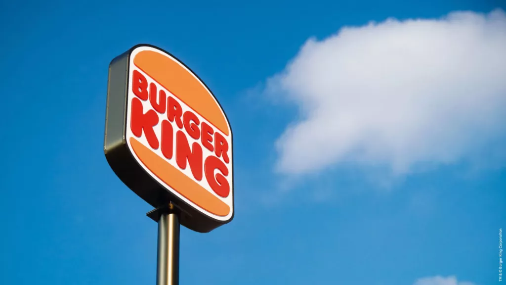
Burger King chose to go back to its roots with a familiar logo, similar to its original 1969 version.
General Motors on the other hand chose a futuristic rebrand to better represent the electrification of its redesigned vehicles.

Burger King’s new branding uses flat design and a custom-designed brand font called “Flame”.
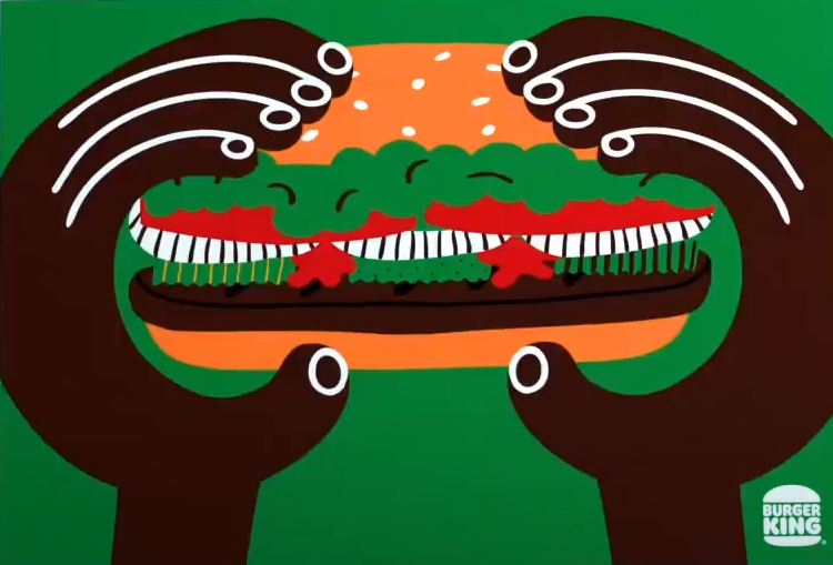
The bold primary red colour contrasts with a rich set of skin-tone colours. These highlight the primary value of diversity that is key to the modern Burger King brand.

This is especially notable as the rebrand follows a context of racialized politics in the United States throughout 2020.

That Burger King chose to highlight inclusivity within their branding, may indicate a broader forthcoming trend.
Burger King selected Jones Knowles Ritchie―a global, design-led creative company―to lead its rebrand.

Our favourite element is the BK hamburger monogram which incorporates both the B when including the buns, and the K as just the filling.

The possibilities for social-change reflected through Burger King’s corporate rebrand are interesting to think about beyond their kitchens.
For Burger King to support diversity as its most core value so prominently, demonstrates the political power of branding.
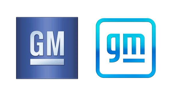
General Motors’ rebrand represents an almost revolutionary change.
It maintains a bridge to the past through common elements such as maintaining some form of underline.
However it is a radical look to a future highlighted by the electrification of GM vehicles.
General Motors introduced their new brand through star-power, with a video campaign that includes: author Malcolm Gladwell, surfer and shark attack survivor Bethany Hamilton, fitness instructor Cody Rigsby, and gamer Erin Ashley Simon.
In contrast, Burger King’s introductory video campaign starred actual employees of the company.
Social-media has been overwhelmingly negative about the General Motors rebrand, while reviews of the Burger King rebrand are mostly positive in the Twitter-sphere.
Both brands elegantly represent the core ethical values of each company:
// Diversity in the case of Burger King
// Sustainability for General Motors
However the rollouts of the two campaigns were strikingly different…
Burger King went with a more comprehensive release—simultaneously releasing the redesigned brand, accompanying video, signage, uniforms, website, app, and social-media—for a full overhaul.
In contrast, General Motors’ release felt more exploratory in nature: A teaser gif on social-media, followed by the star-studded video campaign.
The most important takeaway may be the importance of aligning organizational and customer values when engaging in transformative change.
Whereas Burger King’s typical customer is diverse and embraces diversity—General Motors’ typical customer may not yet understand the radically different, electric future envisioned by the company.
The discovery process should include aligning values which might have borne out a more traditional, less radical redesign for General Motors.
Moreover, after a tumultuous 2020—and with uncertainty on the 2021 horizon—many of us take comfort in the nostalgia of a more familiar past. It may be the most compelling design trend in the new year, and why what’s old may be new again.