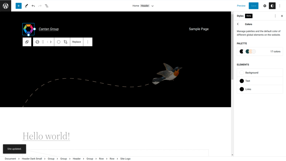
WordPress has been fairly accessible out-of-the-box for a number of years now. For most users however, an out-of-the-box theme is not a great way to allow your brand to stand out.
If you had the skillset (or budget to hire said skillset), you could fairly easily develop a custom, accessible WordPress theme.
Otherwise, a mix of drag-and-drop builders and plugins would allow almost anyone to hack together a functional and unique website. However accessibility would usually fall to the wayside with this mixed-bag approach.
The latest Twenty Twenty Two theme from WordPress may be a game-changer in this regard. It allows the Gutenberg editor editing control over the base Twenty Twenty Two theme. So anyone can now develop a fairly unique website without having to shop around for skilled developers. No more having to look under-the-hood of 3rd-party themes and builders to see if they deliver what they claim in accessibility.
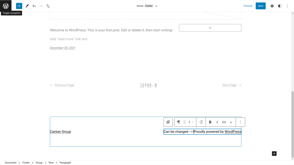
Ooh lookie here, 2022 is the first time a stock WordPress theme lets you change the attribution in the footer without poking around in code.
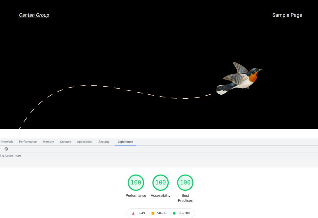
As with past TwentyX themes, it delivers a perfect base Lighthouse score.
Keyboard accessibility and other manual tests also pass with flying colours (yes it’s punny… as with the theme, bird metaphors abound).
There are two ways to get at the new Themes editor:

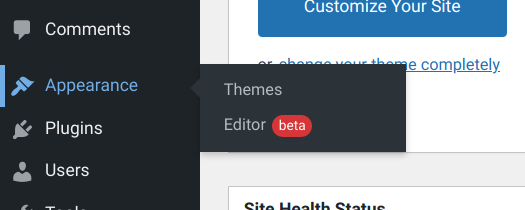
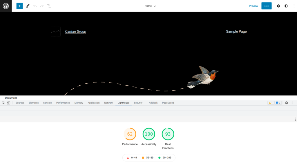
While we had anticipated a perfect Lighthouse score for the frontend, we were genuinely shocked to find a perfect Lighthouse accessibility score for the theme editor. Truly above and beyond!
Typography, colours and layout can now all be defined through the theme editor.
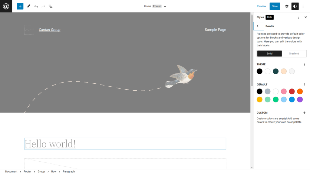
Another unique addition is the ability to define your colour palette through the theme editor. Yet another dependency no longer in the hands of theme designers.
You can define a host of colours, gradients and select various colour filters throughout the Twenty Twenty Two theme.
As expected, the navigation for the Twenty Twenty Two theme is fully keyboard accessible:

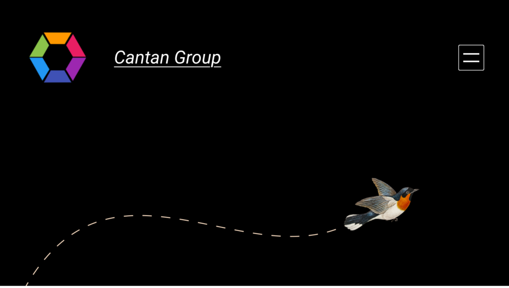
That goes for mobile as well with a sleek two-line menu button replacing the traditional three-line hamburger icon found in Twenty Twenty One.
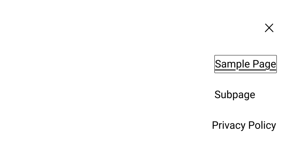
One disappointment with the expanded menu is that it does not nest subpages neatly, opting to indent them from the right margin which can look awkward.

But even more super-awkward is the desktop sub-subpage menu layout which presents a tiny rightward-facing button on the right-hand side to reveal a menu on the left-hand side.
Theme designers may have some work after all to touch up some imperfections in the menu—but not for long.
With the amazing capabilities that the Twenty Twenty Two theme brings to WordPress, we expect future iterations to quickly take away market-share from existing themes and for good reason.
Accessibility legislation such as the Americans with Disabilities Act (ADA), the Accessibility for Ontarians with Disabilities Act (AODA) and more are mandating that organizations provide their users accessible websites.
With the WordPress theme market a hodgepodge of shady themes and bundled plugins, it makes sense to base your website on a well-supported, accessible stock theme.
The accessibility that is baked-in to the WordPress Twenty Twenty Two theme is the most compelling reason for users to not stray too far.
If you’re looking for an experienced hand to help your organization with its accessible WordPress theme and custom plugin development, connect with us at the contact form below.
